REno Jazz Festival

Branding | Campaign Design

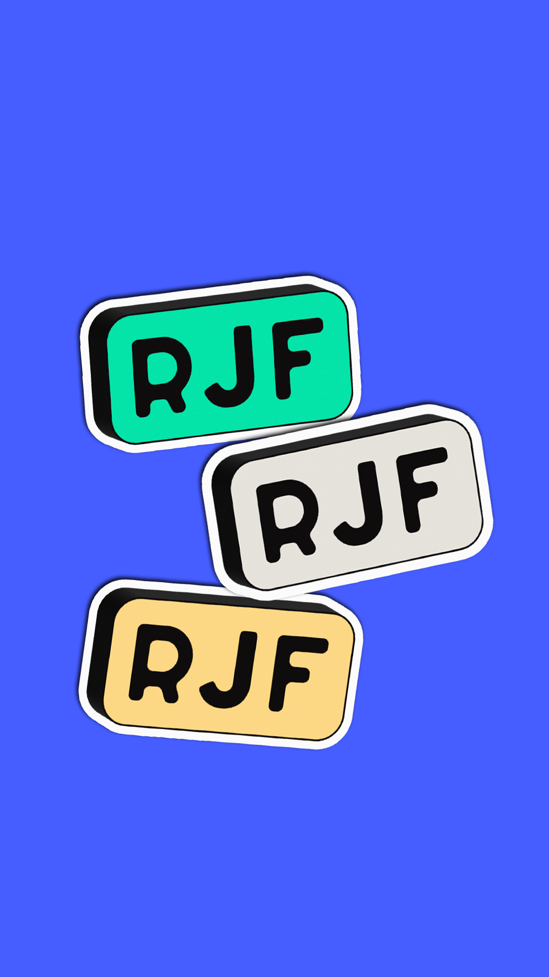
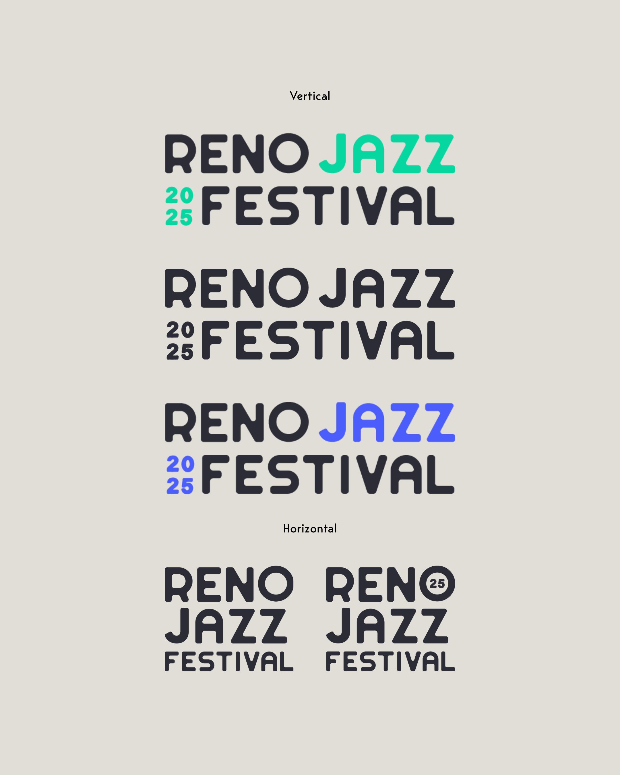
Jazz is one of the most incredible types of music that we have today. That's why when the Reno Jazz Festival reached out to us to create a new logo for them we jumped at the opportunity.

THE CHALLENGE

Design a logo that appeals to the target demographic, focusing on band directors aged 30-50. Include movement and flow, staying away from hard lines, too much structure, and imagery that’s “on-the-nose” music or instruments.

THE SOLUTION

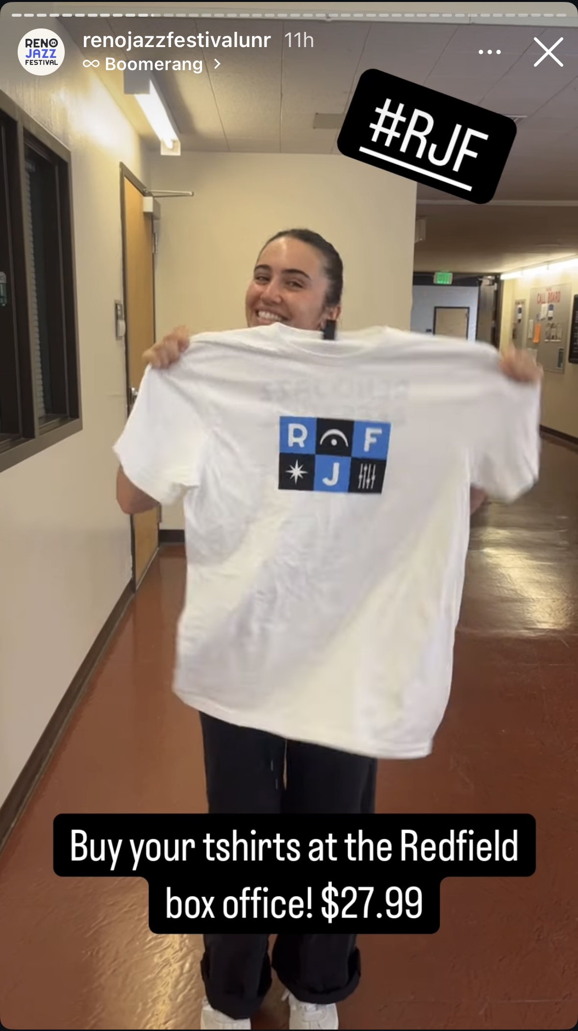
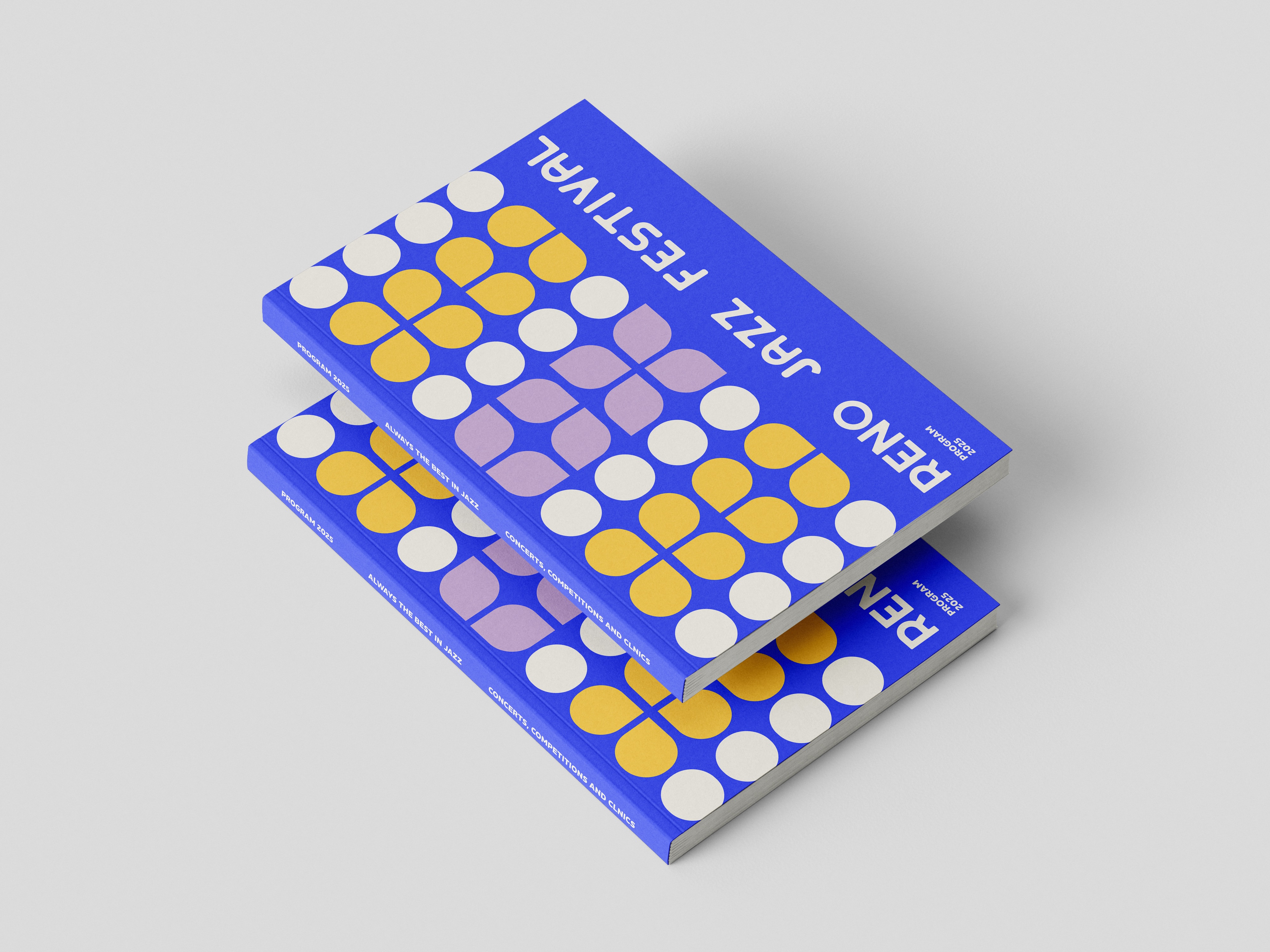
We chose a modern, colorful color palette that aligns with a friendly, modern, and fluid aesthetic. To complement the logo, brand icons and assets featured geometric shapes that visually echo the rhythm, flow, and improvisational nature of jazz music. These shapes act as a visual metaphor for the dynamic movement of jazz, seamlessly tying the brand's visual identity to the emotional and kinetic experience of the genre.

Let's Talk

It could be a coffee. It could be a call. If you want to change the world like we do - we want to hear from you.

Contact us