ARCHES FLORAL DESIGN

Branding | Logo Design

View Website
Arches Floral Design is a boutique floral studio known for its romantic arrangements and refined aesthetic. When they approached us, they were ready to evolve beyond their local roots and step into a new era of elevated design. Our goal was to create a brand identity that captured their artistry, sophistication, and timeless elegance—while positioning them to attract discerning clients across the Tahoe and California markets.

THE CHALLENGE

Previously known as Reno Arches Floral Design, the brand felt too localized to northern Nevada and wanted to evolve to attract higher-end clients in Tahoe and California. Their old identity lacked the refinement and distinction that reflected their elevated floral work and design sensibility. They needed a brand that would communicate artistry, luxury, and timeless beauty beyond geography.

THE SOLUTION

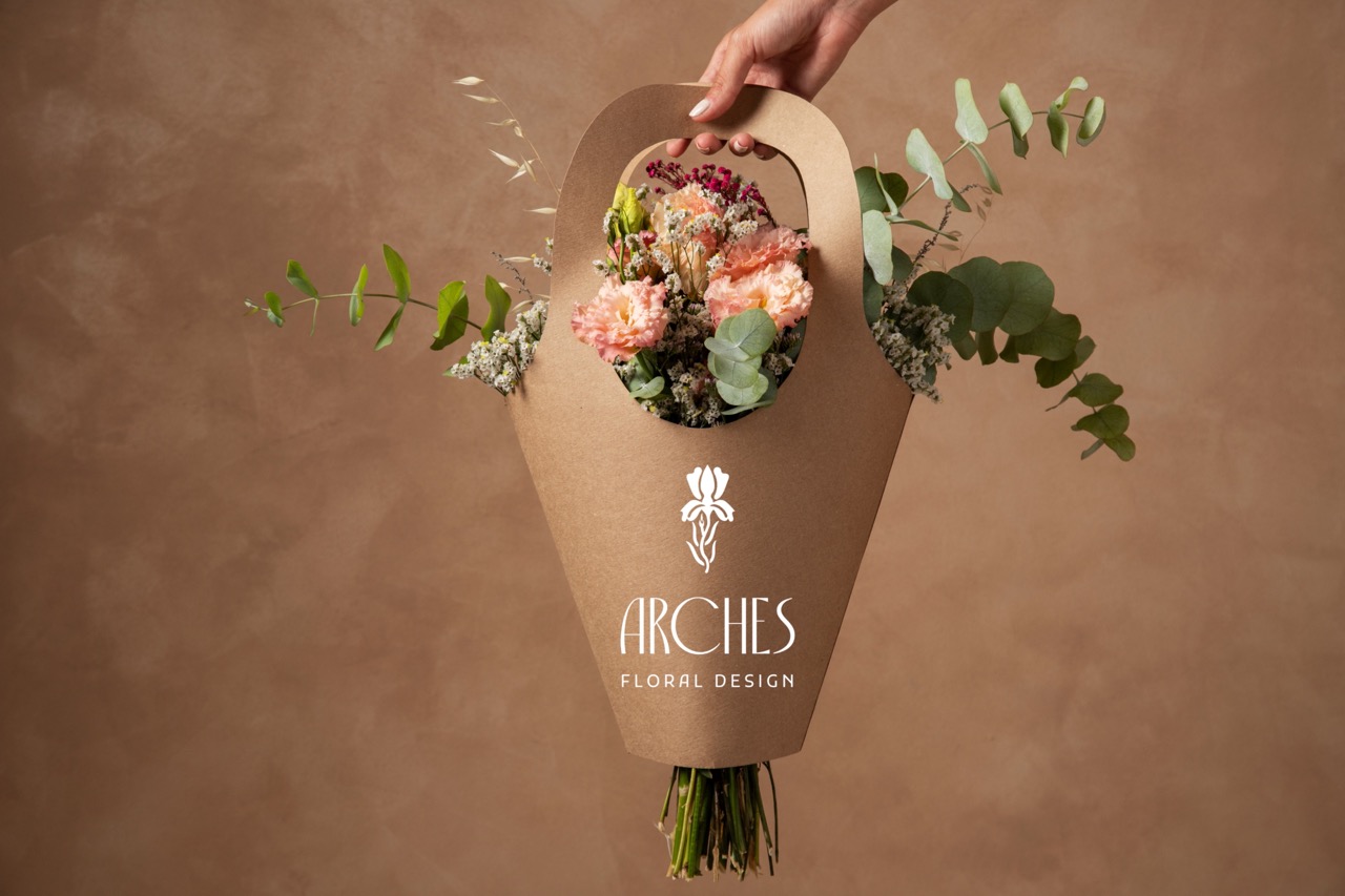
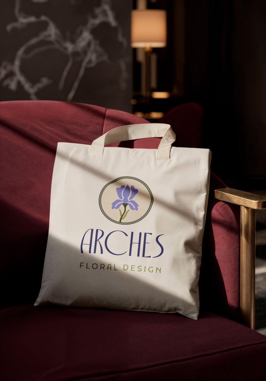
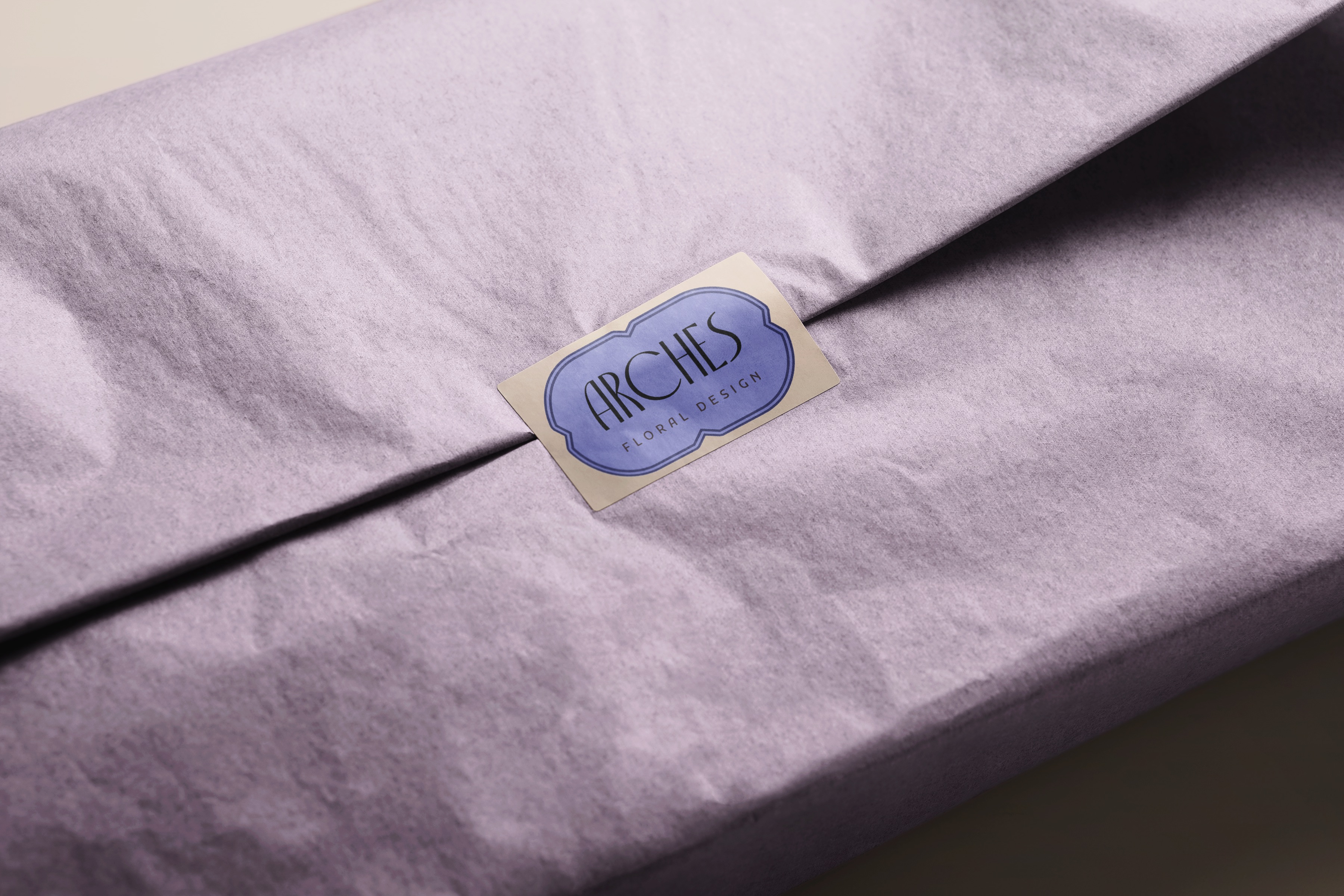
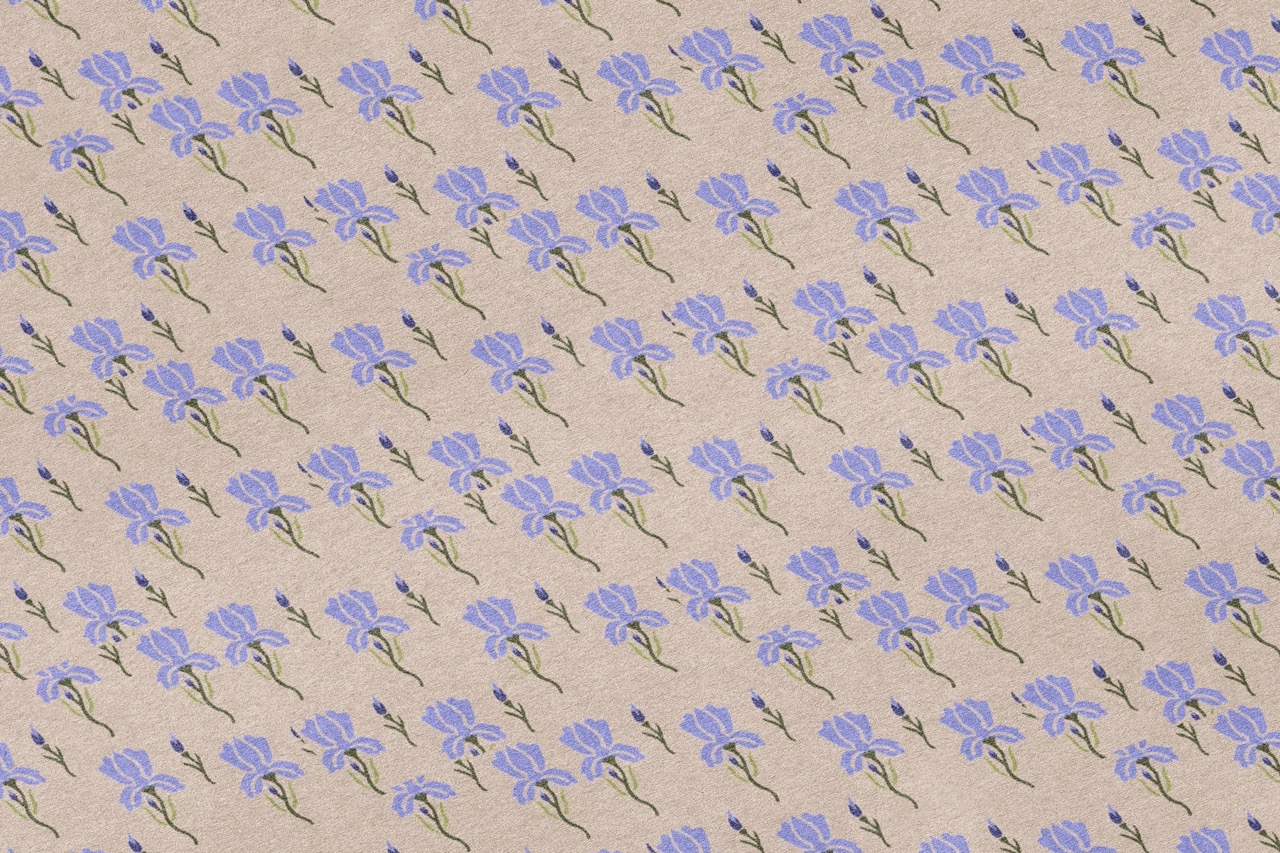
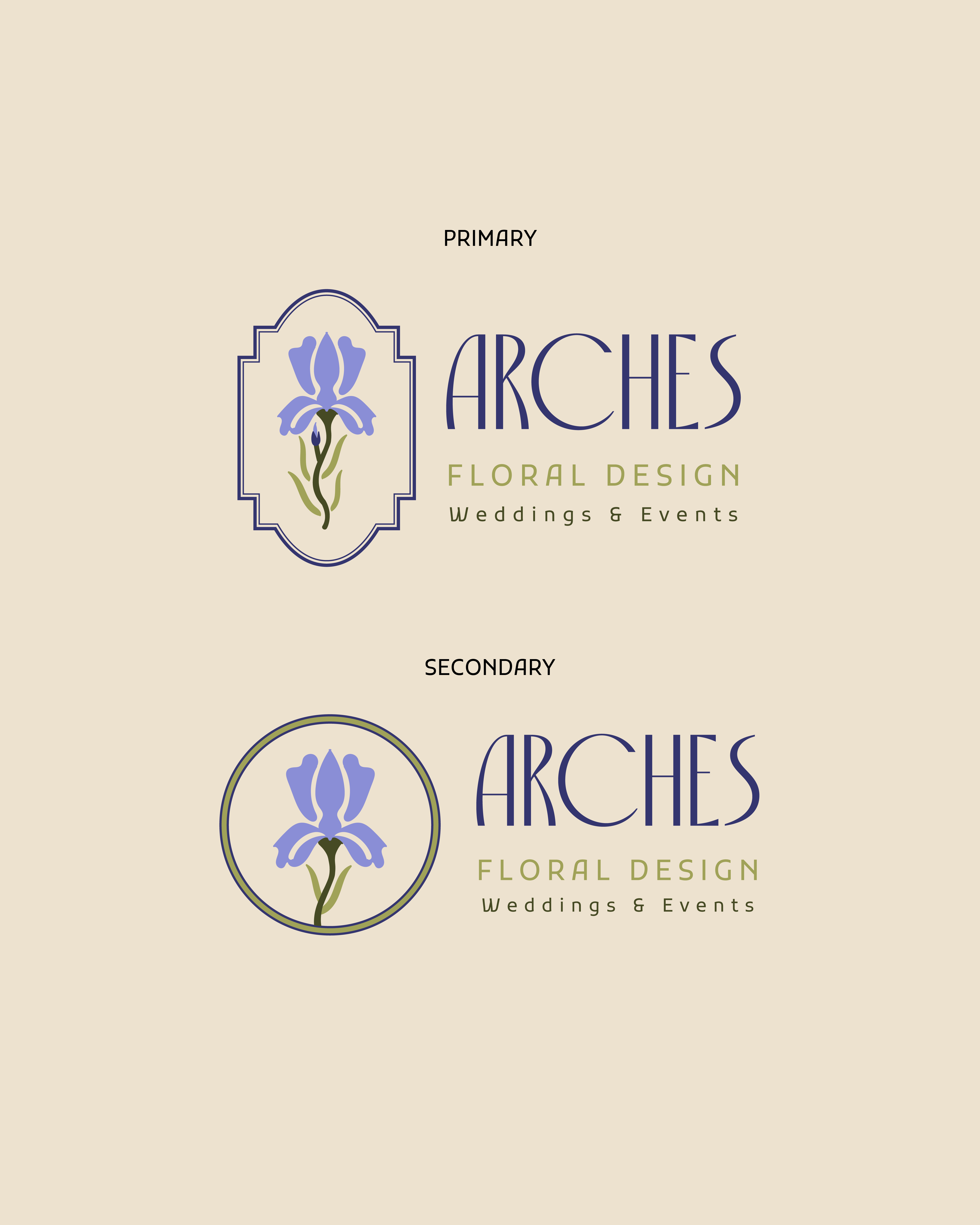
We reimagined the brand as Arches Floral Design, creating a visual identity inspired by the ornate frames and flowing typography of the Art Nouveau era. The new design system introduced elegant lines, natural forms, and rich textures to mirror the studio’s handcrafted approach. Every element, from the logo to the color palette, was built to evoke sophistication and artistic heritage.
Let's Talk

It could be a coffee. It could be a call. If you want to change the world like we do - we want to hear from you.

Contact us